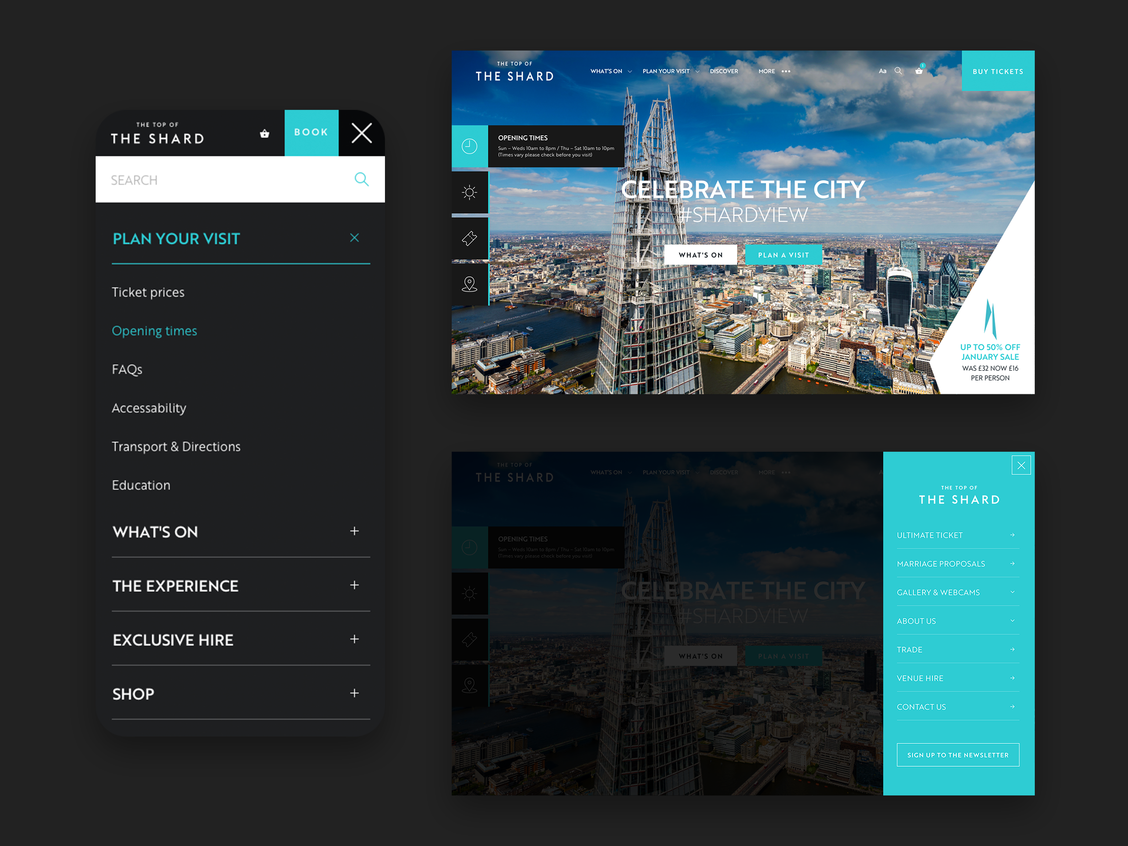
Top of the Shard
Elevating the digital presence of the highest viewing platform in London
Overview
The View from the Shard is a tourist attraction based in London’s tallest building, The Shard. It is the highest viewing platform in London and is the only place to see the entire city all at once.
My Role.
I was involved in putting together the initial pitch for the project and led all work on subsequent information architecture, wireframes, design and prototyping of the final website.
The Outcome.
A completely new, re-branded digital destination with improved customer journey’s path-to-purchase and increased revenue.

The Challenge.
The viewing platform at The Shard was approaching a complete re-furbishment of their experience along with an update to their brand.
To coincide with this they wanted to update the website with the new brand and take the opportunity to make improvements to the user experience.
We were tasked to discover how we might improve the users path to purchase to reduce the number of users dropping out before completion whilst also increasing dwell time and improving user engagement throughout the rest of the site.
The Approach
1 — Research
Over the last 5 years The top of the Shard had gained insights from analysis of millions of attendees. These were used to highlight the weaknesses where improvements could be made. It was established that the new design would be required to improve customer engagement and simplify the users journey to purchase tickets.
Working closely with the client, it was also clear they required the ability to quickly and easily create new content, pages and custom ticket types for new events.
2 — Information Architecture
Whilst creating wireframes for the site we focused on the user flow of the purchase path. Conclusions from our research were used to create user stories for the purpose of identifying the priority of content and navigation. Features were then built in for testing to allow us to implement an iterative programme of improvements based on test results.

3 — Brand Design
The new brand was designed to create a more premium feel with more readable typography and simplified content. Part of the brand included a set of angled shapes referencing the shape of the shard. These were Incorporated as decorative elements that helped bind content elements together on the page.

4 — Navigation
A priority menu was used to highlight the key actions identified in the research. On the homepage, quick access was made to important information about planning a visit (opening times, weather, location etc) along with promotions and current events.

5 — Path to purchase
The new customer journey is based on insights gained from analysis of millions of attendees over the past 5 years.
…Ticketing integration was improved and new features for dynamic pricing and contextual upsells incorporated into the process.
6 — Customer Engagment
We created a reason for users to come back to the website by highlighting regularly updated blog and social posts featured across the site.


